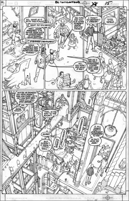
Today would have been comic book artist Seth Fisher's 42nd birthday. I discovered his work some 10 years ago, and immediately fell in love with it, recognising a kindred spirit - someone with a similar love for detail, linework, and humour - but whose style and craftsmanship were (and probably will always be) far above mine, something for me to aspire to. If you don't know his work, pop over to FloweringNose.com and check it out. The first thing that will probably strike you is the crazy amounts of detail and the quirky/surreal humour. But Seth was also an exemplary draughtsman - his grasp of space and perspective were always spot on (perhaps due to his other love: maths). Here is a good example of all these aspects, with a nod to M. C. Escher (it's the line art to a page from Willworld, his take on Green Lantern):
Seth was a thinking artist. Most artists - especially of the comic book/illustrator variety - are problem solvers: getting perspective and anatomy right, getting things to fit, expressing character, telling a story and creating dramatic tension, etc. But Seth seemed to be especially concerned with technical issues, always looking for new ways to approach things, pushing the borders of convention. Seth's mum, Vicki Fisher, maintains a blog over at FloweringNose, which I recommend you to visit, where she discusses Seth's work at length. I won't attempt to rehash any of her insights here, but seeing his work again today reminded me of one of the key differences between artists: those who are more attracted to line, and those who are more drawn to tone and colour. I count myself among the former - as, I suspect, did Seth (although he was very adept with his use of colour). Obviously, any artist should really develop both sides, but even so there will always I think be a leaning one way or the other. This must make a difference with the way people draw, and how the brain processes and reproduces what it sees: those drawn to line, I think, are more aware of what it is that they are drawing, how it's constructed, what its purpose is (more left-brain verbal?), whereas those who operate in tone and colour think more in terms of how things appear to them (more sensuous, emotional, pictorial). Anyway, just my rambling thoughts - but it interests me. Anyone have any thoughts?
Back to the comic (trying not to be too depressed at how good Seth is...). Happy birthday big guy!
Wednesday, 23 July 2014
Subscribe to:
Post Comments (Atom)


No comments:
Post a Comment