Thursday 31 July 2014

More page 1 colour updates

Here's 2/3rds of the first page in its latest stage of colouring (colouring is slow work - apparently...):


Highlights still to add on these and the remaining two panels, but I think we're getting there in terms of the look and feel of the comic. So, hopefully things will be quicker from here on. :)

Tuesday 29 July 2014

Page 1 colour test

Here's our first attempt at colouring LiaDR (the first panel of page 1) - 'our' being Southwell Jnr with me criticising and nit-picking:


As you can see, quite a muted colour scheme. Some highlights and shadow issues to work out, I think, but Southwell Jnr has done a nice job so far. Now the question is, what should I pay him? I'm assuming he will no longer accept payment in Pokemon cards...

Flatter and colourist rates, anyone?

Will post more of this page soon.

Edit:

Here's a tweaked version:


Monday 28 July 2014

Freud vs Nietzsche in the gallery - finished!

Here's the third page from the comic book sample (actually the first page from chapter 4 - Freud and Nietzsche):


Quite fun researching all the art - which are all based on actual paintings (pretty much). Prizes for guessing them all... [Editor's note: there are no prizes]


Thursday 24 July 2014

Chapter 4 Page 1 - wip

Here's a sample from further on (top panel of what will be a two panel page). I wanted something different for the sample material for the book proposal, so here's the young Freud in a sort of waking dream where he discusses his ideas with Nietzsche. The idea is that as they walk through the gallery, each illustrates his point by pointing at a painting/sculpture/etc.


By the way, in case you don't believe me, here's the young Freud (with his missus):


Wednesday 23 July 2014

Page 2 and the Science of Speech Balloons

Here is Page 2 of LiaDR, complete with text balloons, and just awaiting colouring:


I'm still not completely sure about the format of the balloons or the font - rounded rectangles appealed to me slightly more than the more common elliptic balloons, and I put everything in standard case font (lower and upper case) before I realised that most comics favour capitals. Anyway, it's all still open to revision at this stage. One downside with rectangular balloons is that you get some wastage in the corners when the text is centred (covering more art than it should). A compromise might be to do 'stepped' balloons (overlapping rounded rectangles for each line?) - which I may try at some later point.

While I'm on the topic, here's what I've learned about speech balloons:

  • You shouldn't draw them at the same time as the line art. In other words, draw all your art then add the speech balloons later (digitally). This allows you to do things like change font, alter text, reposition stuff - in short, it just gives you more flexibility. The only reason not to do this would be to save on drawing the areas that would be behind the balloons - and we're not that lazy, are we? :)
  • There's a rhythm to where they should appear, and how much text there should be. They are as much a part of the composition as the art. Obviously, it's not always easy to serve both masters (text and art), but ideally they should complement one another. This said, I'm worrying a little that there's too much text on this page - especially panel 5.
  • It is governed by complex conventions. Have a look at this lettering guide on Blambot. I realise that not all these conventions are strict - I've already broken some - but conventions also provide a common language that is important if you want people to understand you. So, much learning to be done still.
For anyone interested, my method for producing the word balloons was to use Photoshop's rounded rectangle tool, then to make paths with the pen tool to join balloons and make tails. Then it can all be turned into a selection and filled with white and the edge stroked with black. The rounded rectangles are also good in that they automatically wrap text.

Anyway, comments welcome. You may notice I got a bit carried away with the cigar smoke in panel 2. :)

Seth Fisher and line v tone

Today would have been comic book artist Seth Fisher's 42nd birthday. I discovered his work some 10 years ago, and immediately fell in love with it, recognising a kindred spirit - someone with a similar love for detail, linework, and humour - but whose style and craftsmanship were (and probably will always be) far above mine, something for me to aspire to. If you don't know his work, pop over to FloweringNose.com and check it out. The first thing that will probably strike you is the crazy amounts of detail and the quirky/surreal humour. But Seth was also an exemplary draughtsman - his grasp of space and perspective were always spot on (perhaps due to his other love: maths). Here is a good example of all these aspects, with a nod to M. C. Escher (it's the line art to a page from Willworld, his take on Green Lantern):


Seth was a thinking artist. Most artists - especially of the comic book/illustrator variety - are problem solvers: getting perspective and anatomy right, getting things to fit, expressing character, telling a story and creating dramatic tension, etc. But Seth seemed to be especially concerned with technical issues, always looking for new ways to approach things, pushing the borders of convention. Seth's mum, Vicki Fisher, maintains a blog over at FloweringNose, which I recommend you to visit, where she discusses Seth's work at length. I won't attempt to rehash any of her insights here, but seeing his work again today reminded me of one of the key differences between artists: those who are more attracted to line, and those who are more drawn to tone and colour. I count myself among the former - as, I suspect, did Seth (although he was very adept with his use of colour). Obviously, any artist should really develop both sides, but even so there will always I think be a leaning one way or the other. This must make a difference with the way people draw, and how the brain processes and reproduces what it sees: those drawn to line, I think, are more aware of what it is that they are drawing, how it's constructed, what its purpose is (more left-brain verbal?), whereas those who operate in tone and colour think more in terms of how things appear to them (more sensuous, emotional, pictorial). Anyway, just my rambling thoughts - but it interests me. Anyone have any thoughts?

Back to the comic (trying not to be too depressed at how good Seth is...). Happy birthday big guy!


Tuesday 22 July 2014

Reflections on a mini milestone, Part 2

As promised, here are my thoughts about the technical aspects of comics production after page 1.

Firstly, what was intimidating was the feeling of having to build a world. So, you're not just drawing a character with a particular background, but situating someone in a virtual environment. In short: You do panel 1 - yay! - and then realise that you now have to draw the same figure again, perhaps from a different angle, with different gestures or facial expressions, etc. The same goes for the background - the figure gets up and goes to the window - what does the room look like from that position? And so on, all of which is a big headache - at least if you're concerned with being consistent (which, I'm guessing, most comic book artists will want to be).

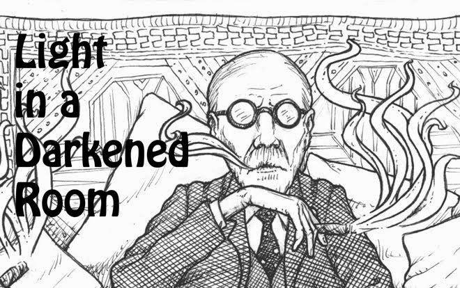
There is a side issue here regarding how faithful to be to reference material. Since Freud was an actual person who lived in an actual time and place (in this case, Hampstead in London, 1939), then it's possible to track down photos of the house (which is now the Freud museum), the surrounding area (Google Earth is handy here), and basically drive yourself crazy with the search for authentic pictures of what Freud's actual chair was like, or what brand of cigar he smoked. I did a bit of this, but quickly realised that (a) I'd go mad, and (b) for the amount of effort involved, it wasn't worth it - the vast majority of readers wouldn't even notice. So, for the sake of saving time, I've decided to take shortcuts - or what is sometimes termed 'artistic licence'. For instance...


Freud's desk is a clutter of objet d'art - little statues, figurines, etc - which would drive me insane to draw faithfully. So, I've made do with suggesting their presence, without too much concern for whether I copy the desk exactly, or even whether the objects are identical from panel to panel. I'm a perfectionist about lots of things, but really who has time for this amount of detail? More importantly, why would you want to? It's art. You want realism, take a picture. (And with that get out clause, I move on...).

I've got a number of other things to say about the technical aspects of comics production, but they can keep until another time. However, I'd just like to finish with what is perhaps the biggest thing that struck me: just how long everything takes. The first page took me about a week - planning, sketching, fine tuning, inking (not to mention lettering, word balloons, etc). I've done another page since then (more next time), but - even if it only took me two days per page - we're looking at almost 300 days of solid work just to do the line art (based on the script, the book currently comes in at 142 pages). If I want weekends free, then we're looking at 20 months to 2 years! How do people do it? I'm talking I suppose about independent creators, here - how do they fund something like this? There's Kickstarter, of course, and publisher's advances, but even so that's a long time for people to wait for something they've invested in. Anyone have any thoughts?


Monday 21 July 2014

Reflections on a mini milestone, Part 1

Aside from some abortive attempts over the years, page 1 appears to be my first ever fully realised comic page. Well, 'fully realised' apart from colouring (and publication!). So, it's a milestone of sorts, and - strangely - I did get a mild euphoria on completing it. I know it's flawed, and there are umpteen things I would improve (and will hopefully learn from), but there's also a sort of relief in finally taking a step down a road you've been meaning to travel for years. And, as the saying goes, a thousand mile journey begins with one step. I know, I know - there's also that other saying: One swallow does not a summer make. However, emotionally and mentally, having made that first step, the second is already closer, and the third, and before you know it you're walking (or have a sky full of swallows - sorry, I've confused myself with my own mixed metaphors!). Anyway, my point seems to be, the invisible line between aspiration and realisation is one that can only be crossed by diving in. Or, as the green sage himself would put it: "Do, or do not. There is no try."

So, what have I learned from my one step? Firstly, not to be precious. What stopped me taking that first step for so long was the desire to make things perfect, to only produce something that would meet my highest self-imposed standards. But such an attitude is crippling to creativity. I could wait to be as good as my heroes - Seth Fisher, Arthur Adams, etc - but, to quote another favourite sage of mine, "That's a long wait for a train don't come". So, better to be flawed and productive that perfect and barren.

I think that's enough flowery nonsense concerning motivation. I'll save my technical reflections for Part 2.


Blurb and page 1

Two posts on the same day - please don't expect this to continue at this pace...

Some more info on the story (something like this will probably be the blurb, should things ever get as far as publication land):


It is 1939. Sigmund Freud, the brilliant and controversial founder of psychoanalysis, spends his last days in Hampstead, London. Having fled Nazi persecution in his native Austria, as the very unconscious forces he sought to tame threaten to tear the world apart, Freud is now dying, the cancer of the jaw that he has fought for the last 16 years having finally taken hold. But his quiet exile is interrupted by the visit of a young academic, Oxford philosopher H. H. Price, keen to discuss his theories, and - for the purposes of illustration - to persuade the professor to undertake one last analysis. Flattered, Freud grudgingly accepts this distraction from his days of boredom and pain, but it quickly becomes apparent that all is not what it seems. Price is no fawning acolyte and is unwilling to play the docile patient, instead resisting Freud’s interpretations, questioning his theories, even challenging his attitudes and past actions. Having spent his life seeking to bring light into the darkened room of the unconscious mind, the great man now finds himself on the couch, forced to perform one final analysis - of himself.


 And here is page number 1 (colour still to be added):


First things first...

Hello! It feels a bit strange typing into the void - whether there's anyone there, etc - but hopefully, eventually, I'll find some like-minded people who share common interests (or at the very least provide an outlet for what promises to be a long and arduous project...).

I should probably use this first post to introduce myself and say a little about what I'm (planning) to do. I'm an illustrator, among other things, and for a long time I've wanted to do a comic book/graphic novel. Figuring that this would be easier, first time, if I could find someone to write the script/come up with ideas, I began the search for a collaborator, and - after a long search - was lucky enough to come into contact with Berit Brogaard - a Danish born philosopher, working in the US, who shared an interest in Freud. So, some months down the line, with the script just about complete, it's now down to me to start producing the first pages (the plan being to get a sample together to pitch to publishers).

Anyway, since I'm a complete newbie at the comics game, I thought I would use this platform to keep interested parties up to date on my progress, but hopefully to also get some support/advice on the long slog ahead. Indicentally, I've been inspired in this by Nate Simpson's wonderful blog in developing his 'Nonplayer' comic - please check it out, if you haven't already - it's awesome stuff.

More soon!